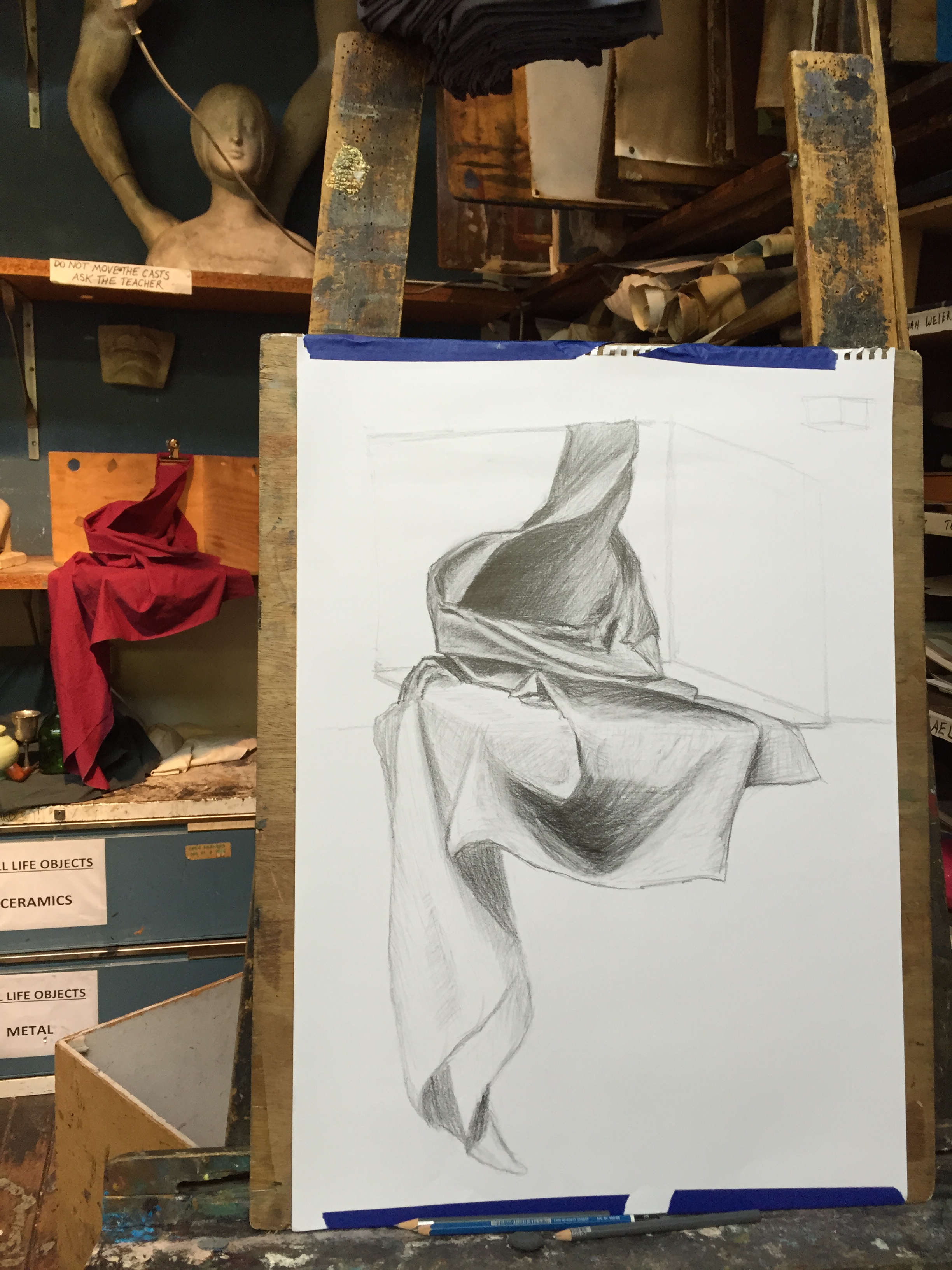
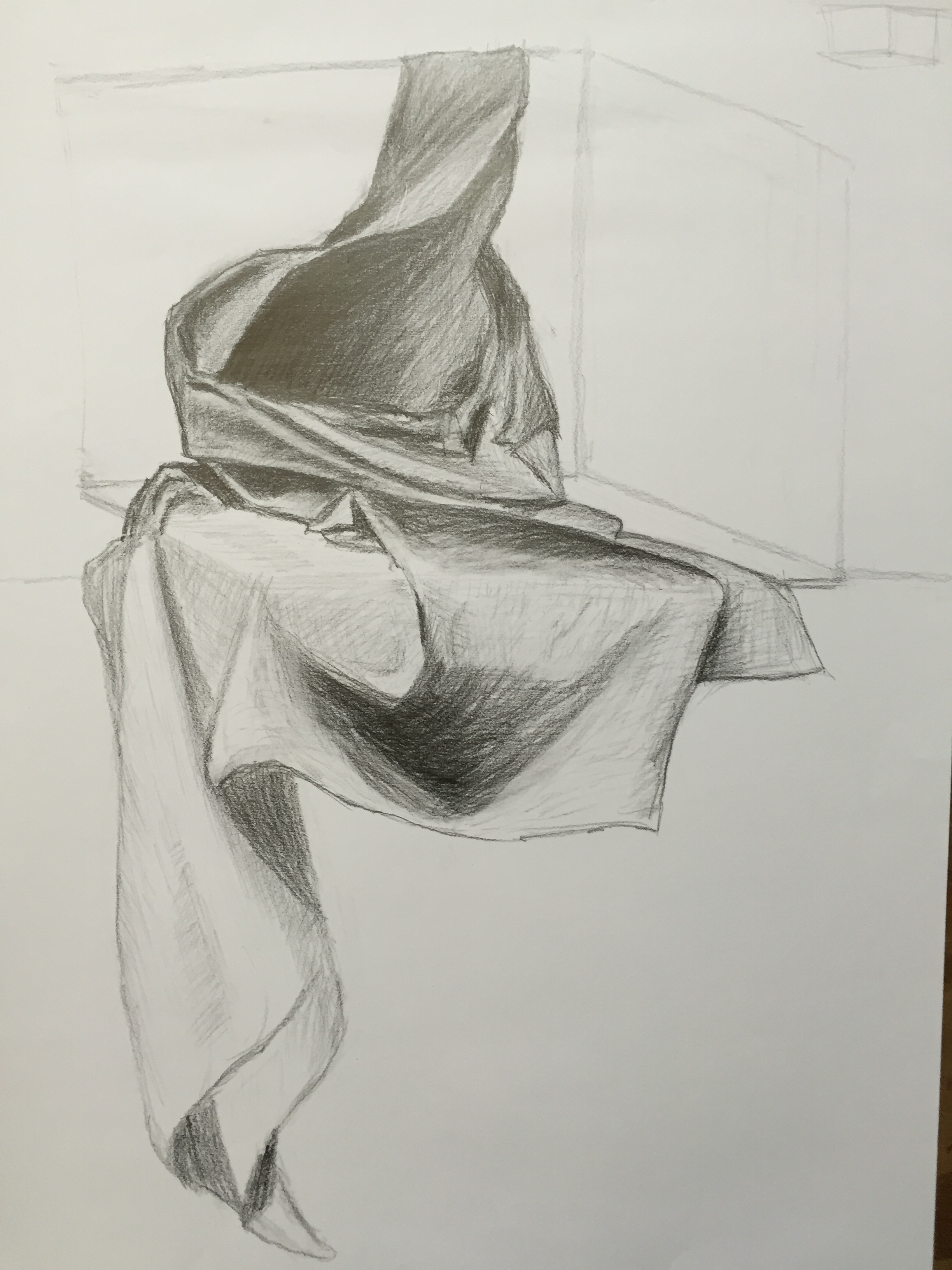
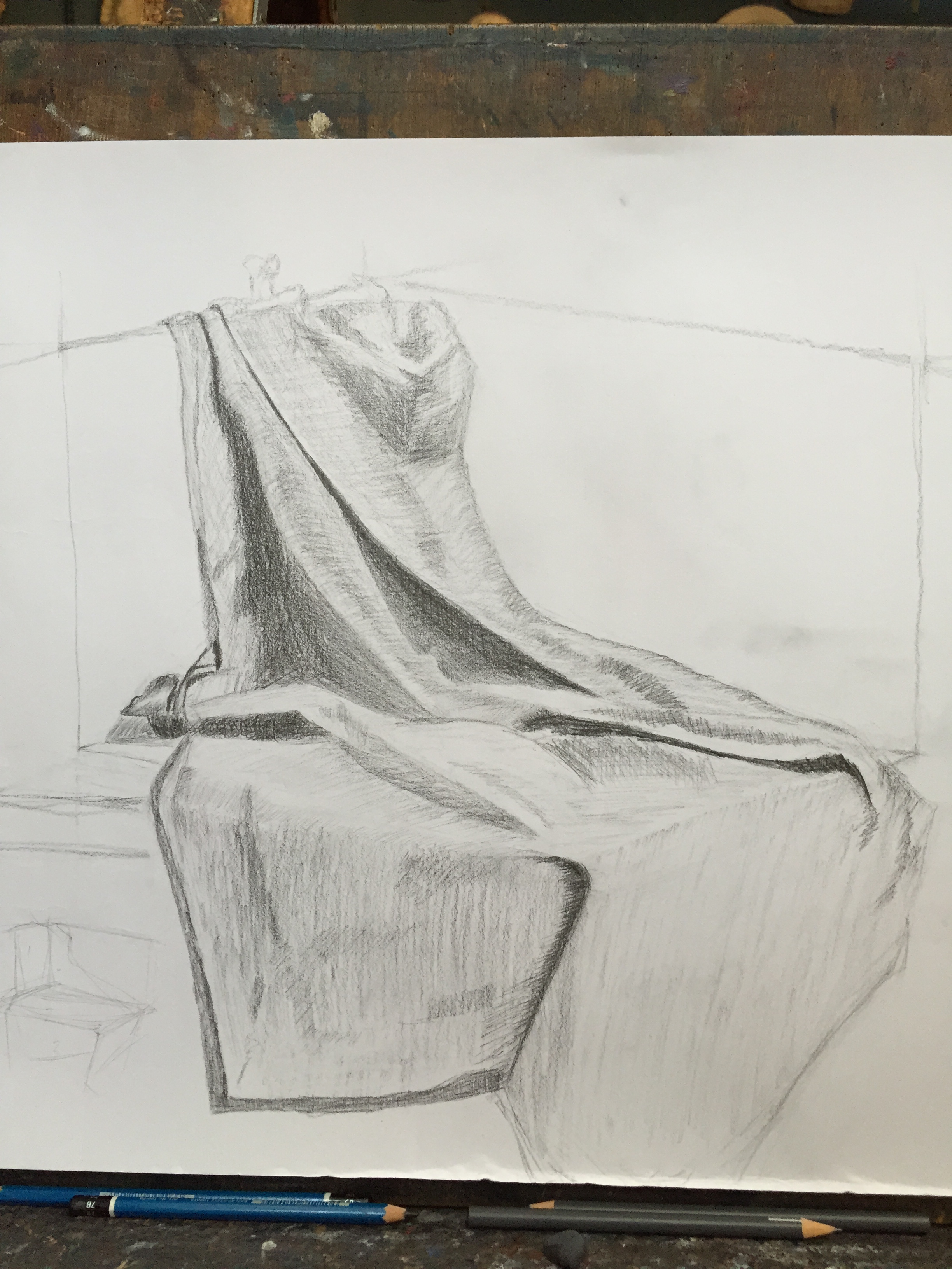
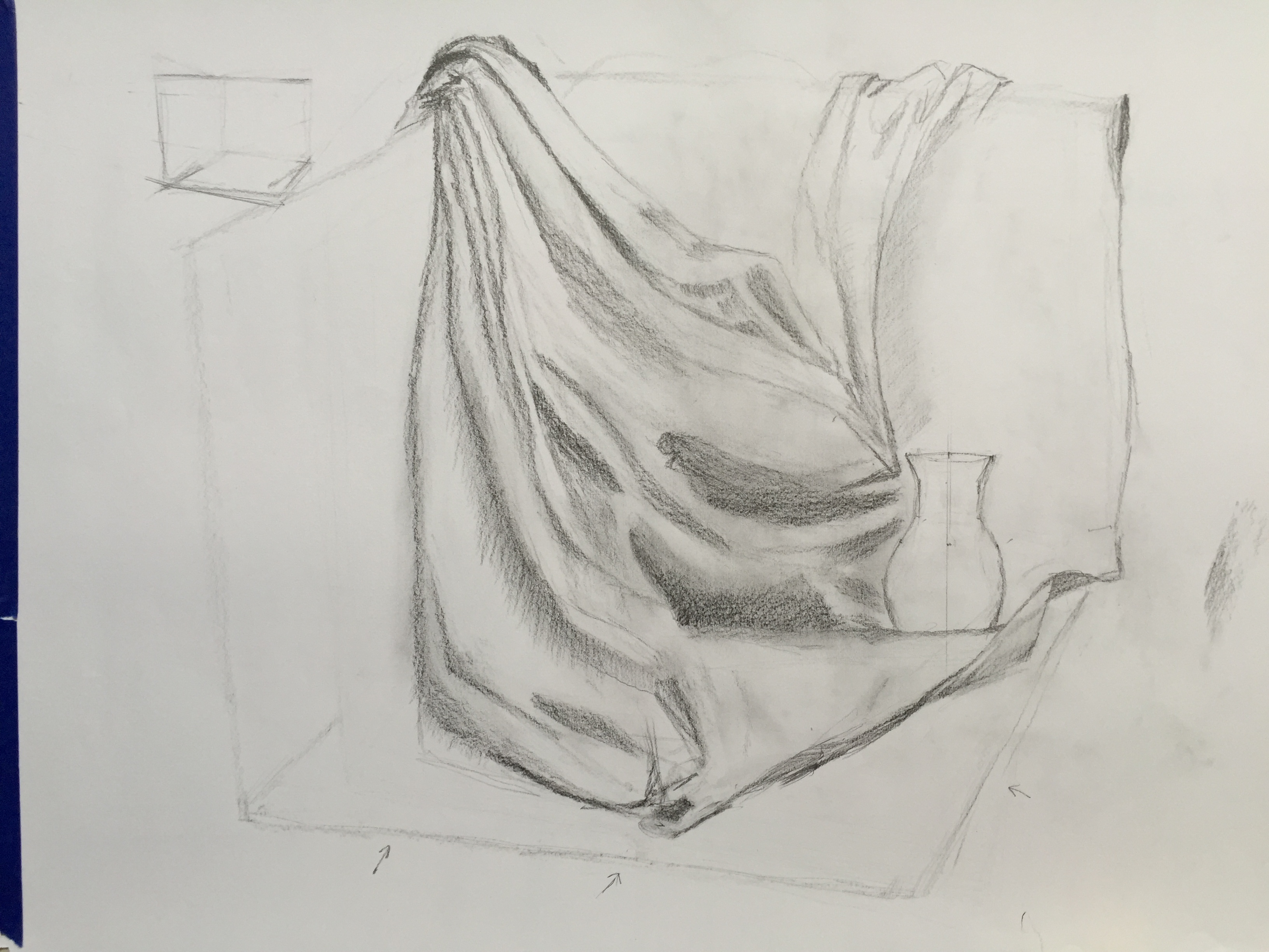
today’s drapery study/drawing. I’m happy with how the fabric drapes over the edge of the box. though now I see the photo I can see parts in the middle & top that don’t match reality & the tones are bit out but hopefully they still have the feel of draping fabric. back to painting next week.
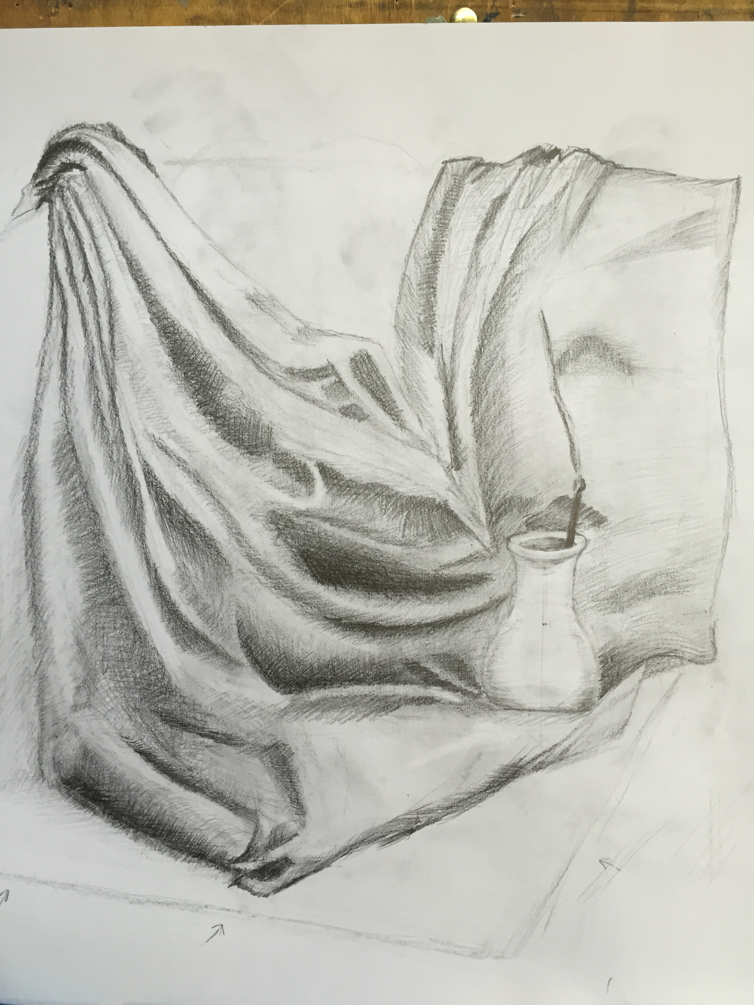
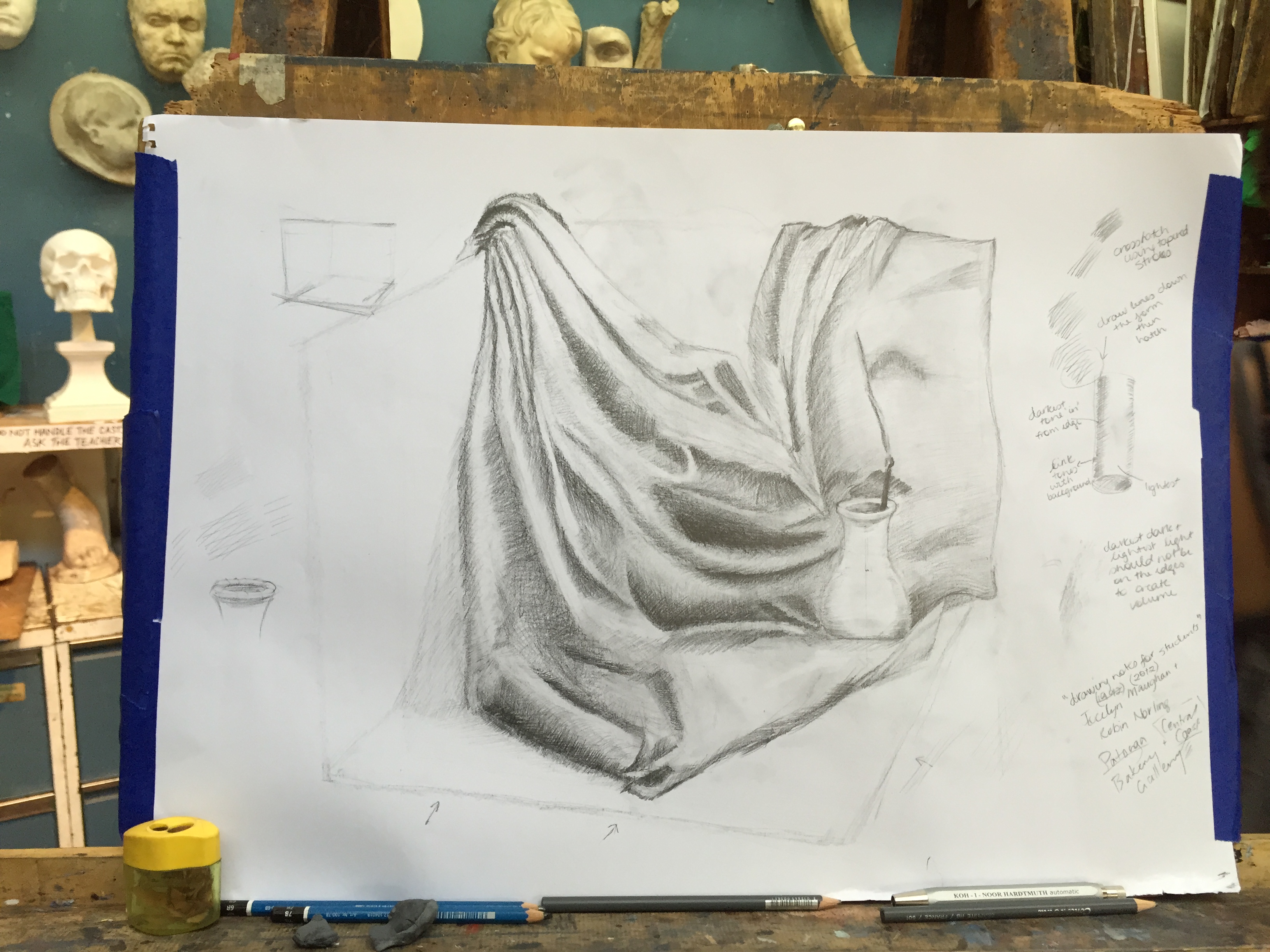
after the still life, I worked on a drapery study – I keep typing this as drawpery! I had my “aha” moment towards the end of the second week’s class, so will start a new one next week. I had been trying to draw more expressively and scribble and smudge with my finger, but my teacher said to draw individual lines as they convey more information. individual lines is my natural way of drawing, so I’ll go back to this next week. it was hard to erase some of the original marks I’d made. I was getting the hang of it by the end of week 2’s class, so will practice more next week
week2 – March 5 2016:
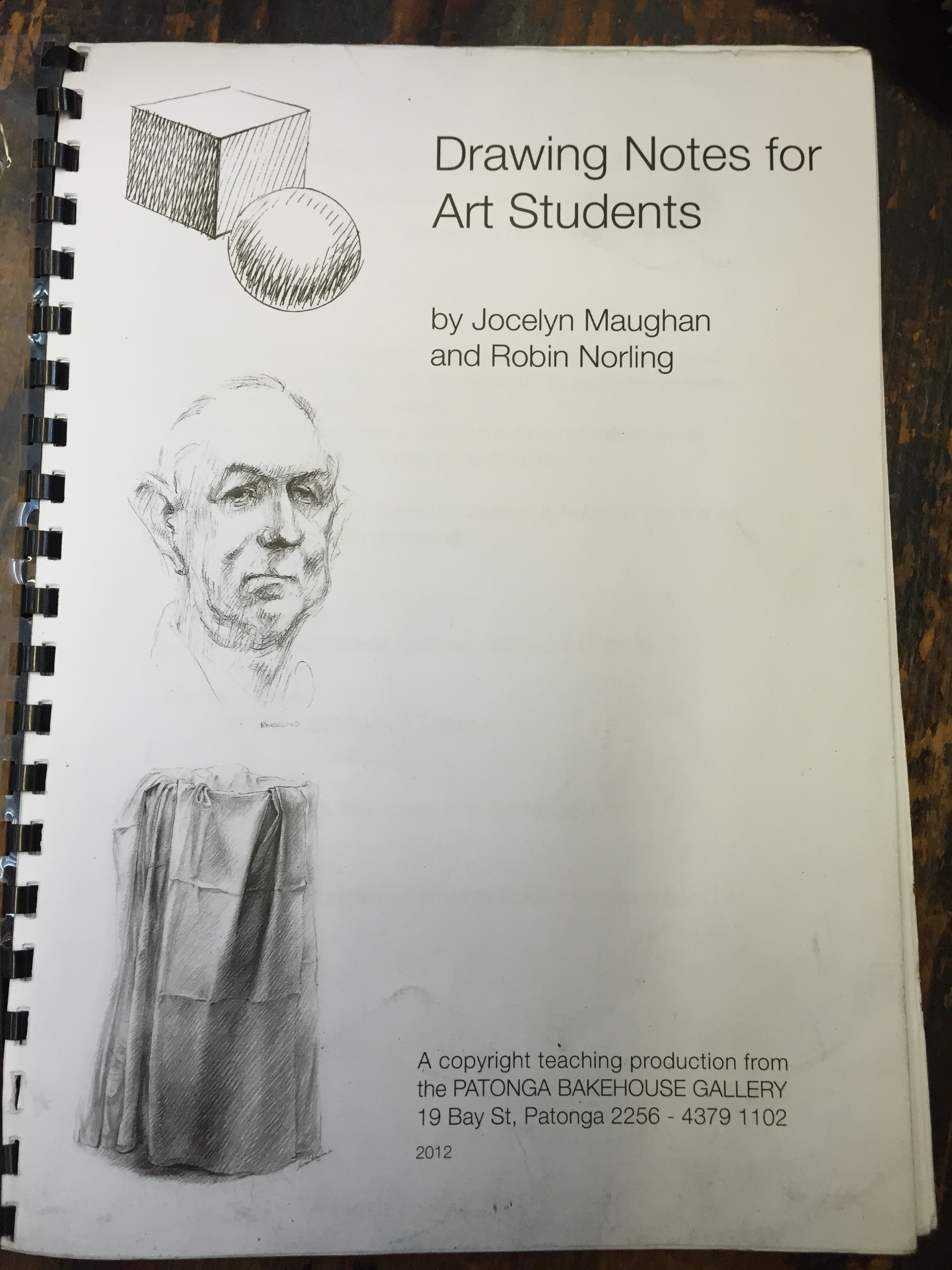
my teacher, Rosalind, brought in a copy of her booklet “Drawing Notes for Art Students” by Jocelyn Maughan and Robin Norling which was a great help. there were drawing tips and techniques inside, showing how to crosshatch and draw draping fabric
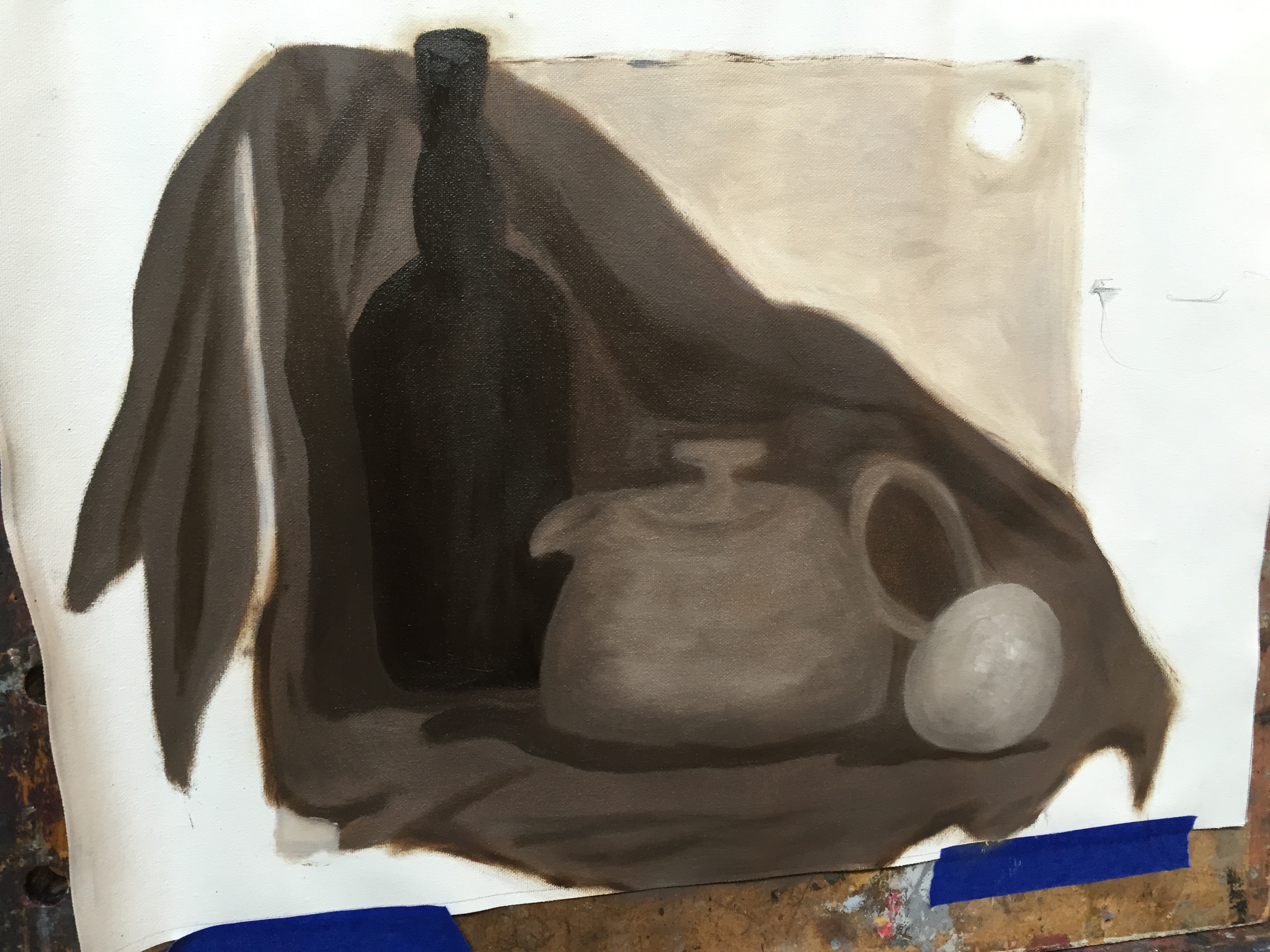
last day of painting class / term today. it wasn’t my best day painting. when I tried to add shadows and to make the objects more 3D, I wrecked the tone so spent most of the day trying to get this back – lots of squinting and standing back to look at it from across the room. eventually I had to wipe the paint off and start again. I’m not happy with the shapes either (especially the teapot) – I lost them on the first day when painting the flat tones with the large brush, and couldn’t get them back in time. oh well. my teacher said he was happy with the tones. so I need to practice drawing objects (and drawing in general). it’s still drying in the shelves at art school so I need to go collect it this week once it’s dried.
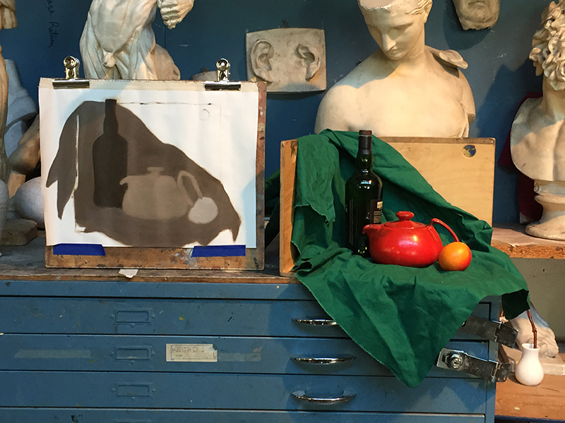
05/12/2015:
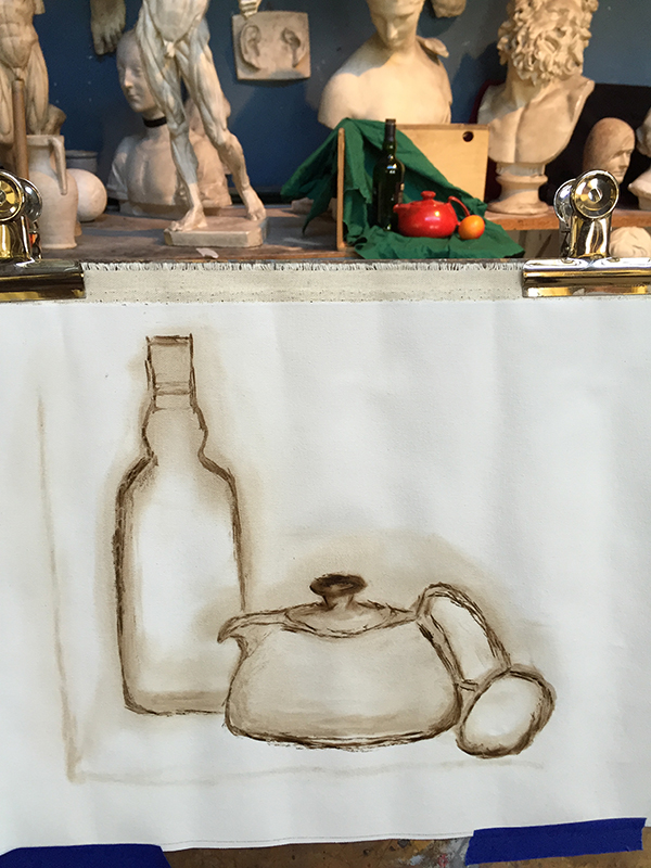
today I started my second tonal still life painting — oil painting #4. after working on the contour, my teacher wanted me to just paint flat shapes in the four tones, no details. if you squint it’s easier to see the tones. when I did this, the bottle (which is dark green) looked almost black. I originally painted it with straight raw umber as I thought it would be the darkest tone, but it’s a lighter brown. when I was fixing the tone of the background fabric, a mix of the white + raw umber gave me a really dark brown-black shade which was perfect, so I overpainted it with this. I had the teapot too dark originally also, so had to lighten it a smidge. I lost some of the contour shape when painting the flat colours, so will have to adjust this next week. but my teacher was happy with the tones so that’s the main thing.
next week is the last class for this term so I hope to finish it and have it dry enough to bring home.
explorations in textiles, mark making, drawing, sketchbooks, art school & uni art work